Brand Guidelines
These guidelines provide an outline of the general rules when using Human API's brand assets. Please, only use the approved brand assets that are provided on this page. Consistent use of these assets helps people recognize the Human API brand and brings trust to every transaction.
THE HAPI LOGO

HAPI Logo Dark
Use on light backgrounds

HAPI Logo Light
Use on dark backgrounds (Sample shown with a gray outline. Real logo is fully white.)

HAPI Logo Light
(Sample shown with a dark background)
LOGO DISPLAY CHECKLIST
Minimum size:
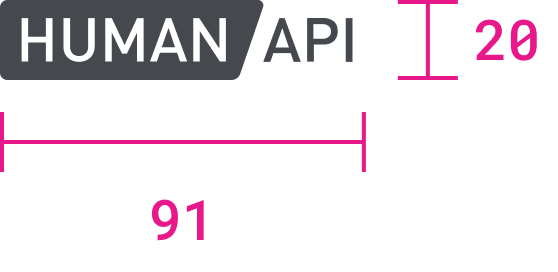
The Human API logo should not be reduced smaller than 20px in height and 91px in width, which maintains the logo’s aspect ratio. Spaces that do not accommodate the minimum logo size and clearance space should switch the Human API logo to the Human API favicon logo.
Clearance space:
The aspect ratio of the Human API logo should not be altered or distorted under any circumstance.

Prominence:
The Human API should share equal prominence when displayed next to other logos, unless previously discussed and approved.
Color:
The logo should remain in full color unless otherwise specified and approved.


Minimum Contrast:
As an organization that strives to be as inclusive as possible, we want to ensure our products and brand are acceptable for a wide variety of users. We strive to maintain a minimum contrast level within our products and encourage our customers to maintain that standard when incorporating our branding into their respective products.
We ask that our logo be placed on solid color backgrounds with a minimum contrast ratio of 4.5:1 per WCAG guidelines.
INCORRECT USAGE SAMPLES

Image backgrounds with dark logo

Image backgrounds with white logo

Poor color contrast

Unapproved logo color change

Multicolored backgrounds with logo

Distorted logo
FAVICON DISPLAY CHECKLIST
Primary Favicon
Secondary Favicon

(Shown with gray outlines to accommodate for the white background. Favicon does NOT include gray lines)
Minimum size:
The minimum size of the favicon is 16 x 16px in height x width. Do not reduce the favicon smaller unless otherwise approved.
Color:
The favicon logo should remain in full color unless otherwise specified and approved.
Usage:
Human API heavily prefers the use of the Primary Favicon. The Secondary Favicon should only be utilized in circumstances where the color contrast ratio between the background and the favicon do not meet the minimum 4.5:1 contrast ratio in accordance with WCAG guidelines.
BUTTON & CTA GUIDELINES
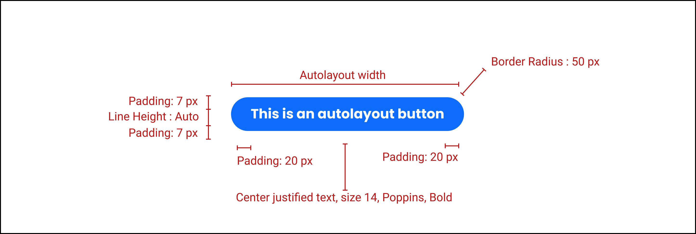
Our Standard Button Conventions:
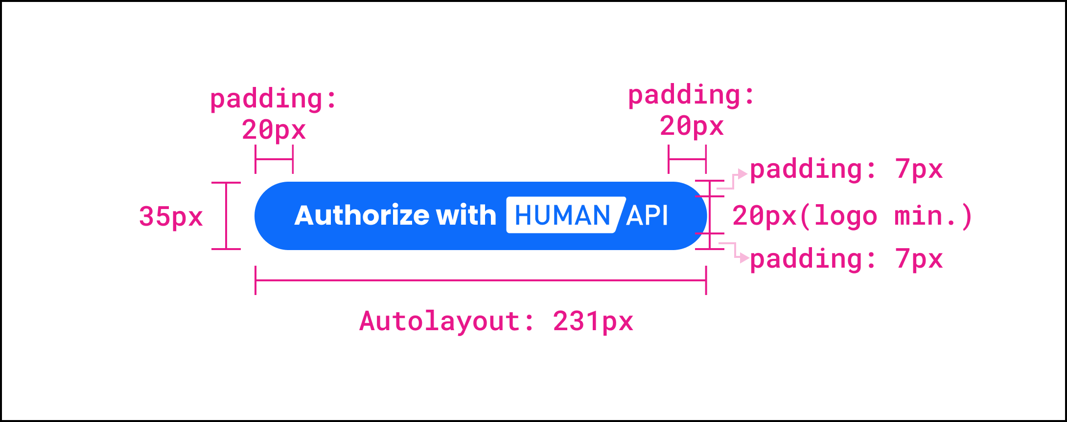
Sample Button Conventions with Human API logo:
BUTTON USAGE
Our CTA buttons provide the pathway to address open tasks and resolve outstanding issues. The Human API logo should be included in external facing buttons unless context regarding the involvement with Human API is provided elsewhere.
We’ve provided a selection of buttons to best fit your individual use cases. For customized buttons, use the conventions outlined above.

Option 1

Option 2
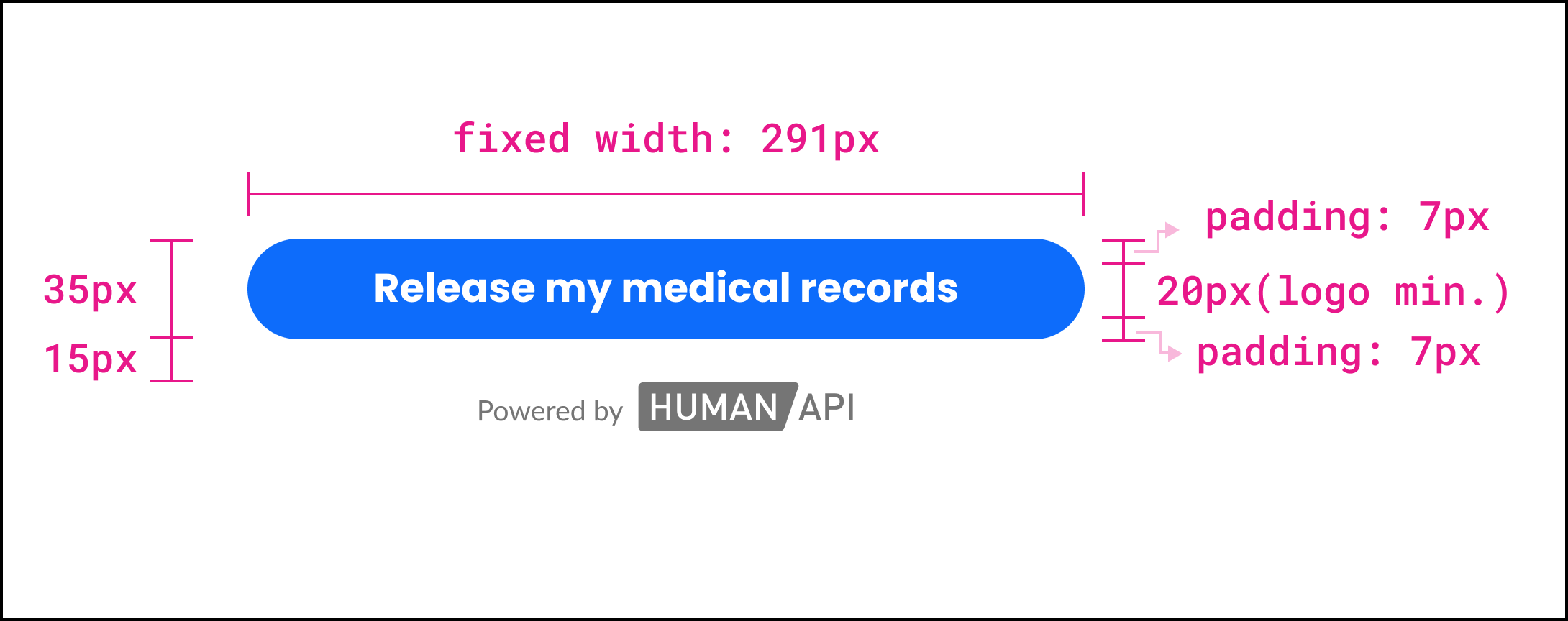
Alternative button - fixed width:
*Must provide context and include “Powered by Human API”

Alternative button - fixed width sample:
*Must provide context and include “Powered by Human API”
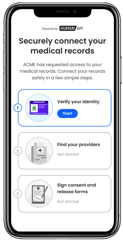
CTA LANDING SAMPLE PAGE
The external facing CTA will often times lead to an end user task resolution page. We have included a sample of where the above CTAs will land in order to provide some context for the use of the button.
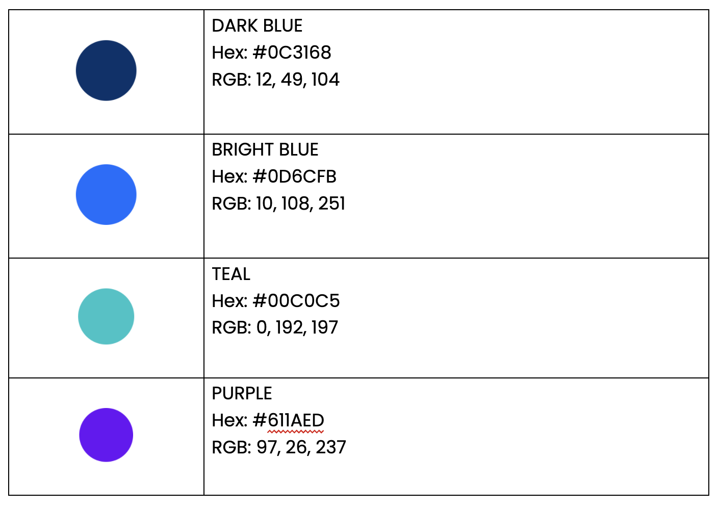
MAIN COLOR PALETTE
Human API’s color palette was designed to be both playful and inviting without compromising brand trust, identity, and consistency
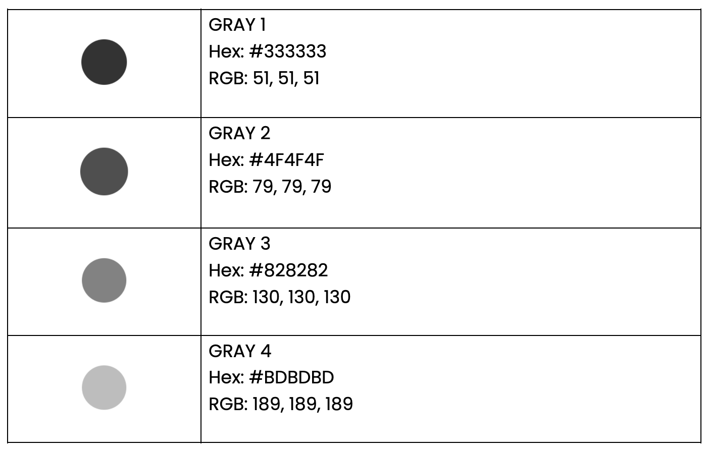
SECONDARY COLOR PALETTE
Various shades of gray are used throughout Human API’s website and products.
Updated 3 months ago
